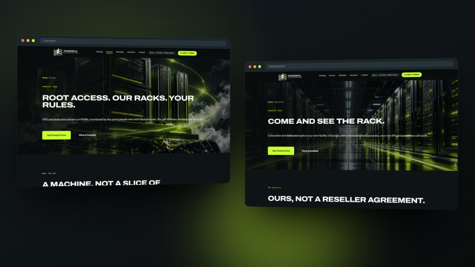
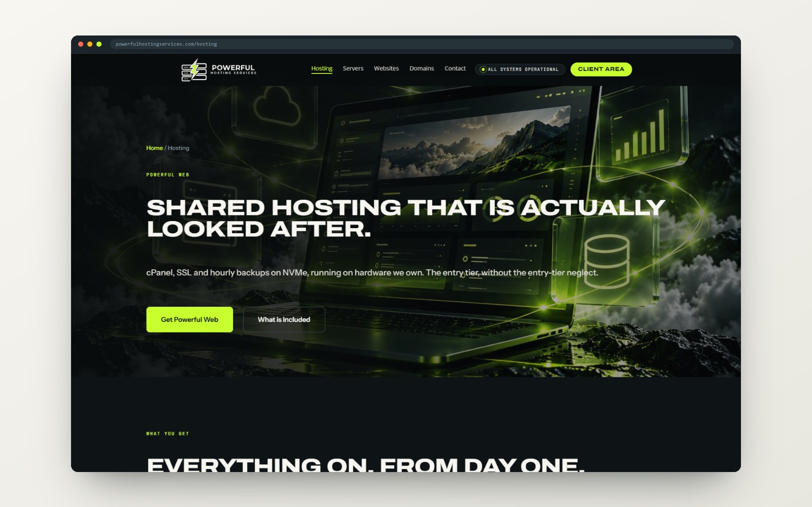
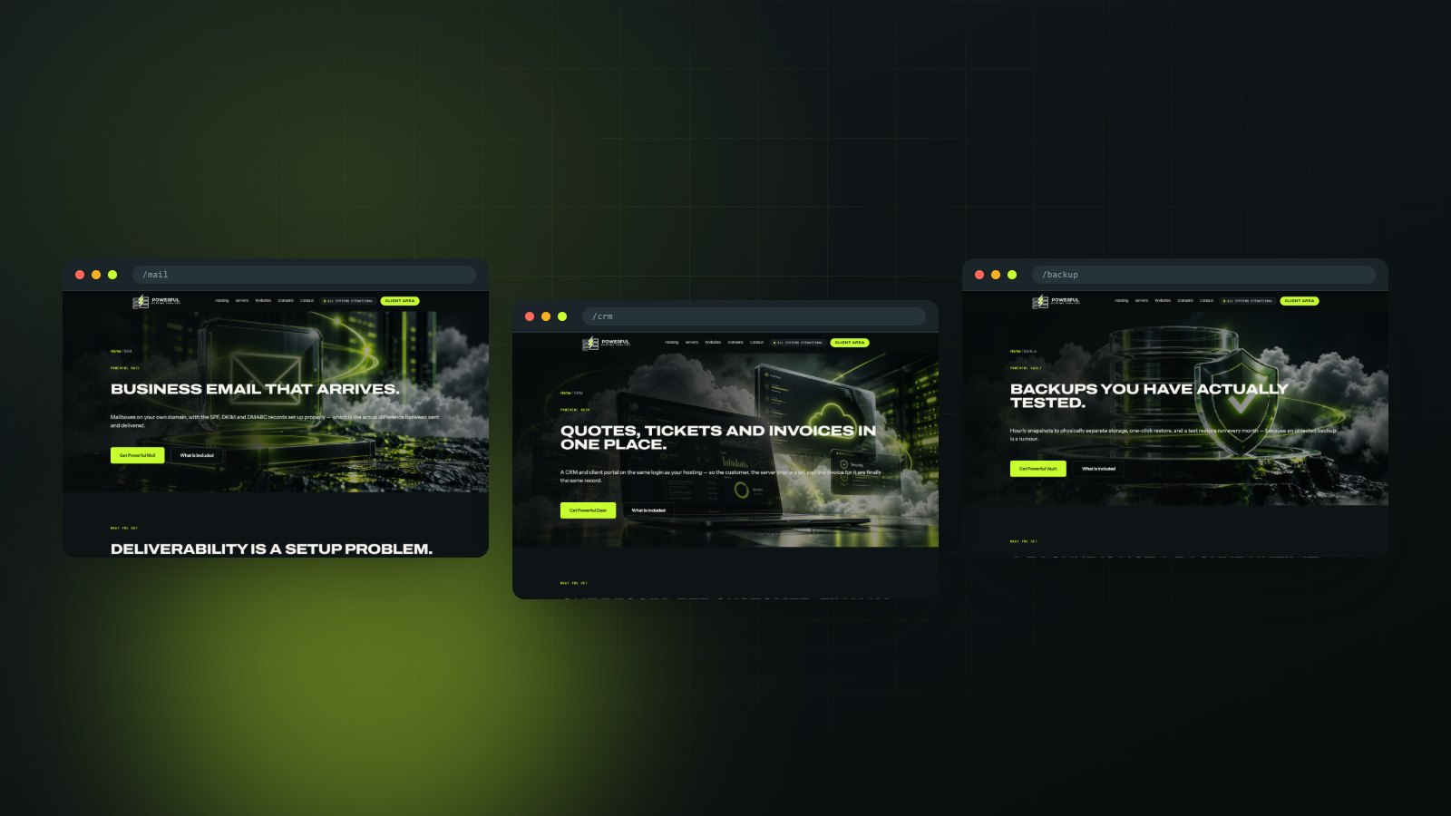
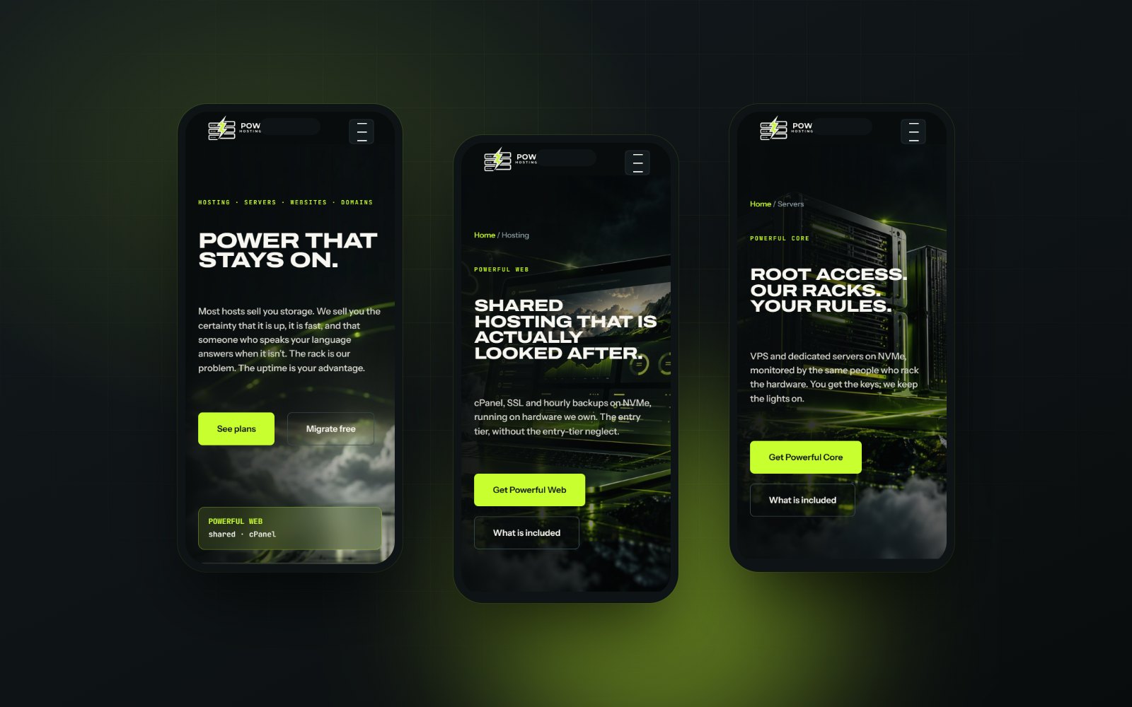
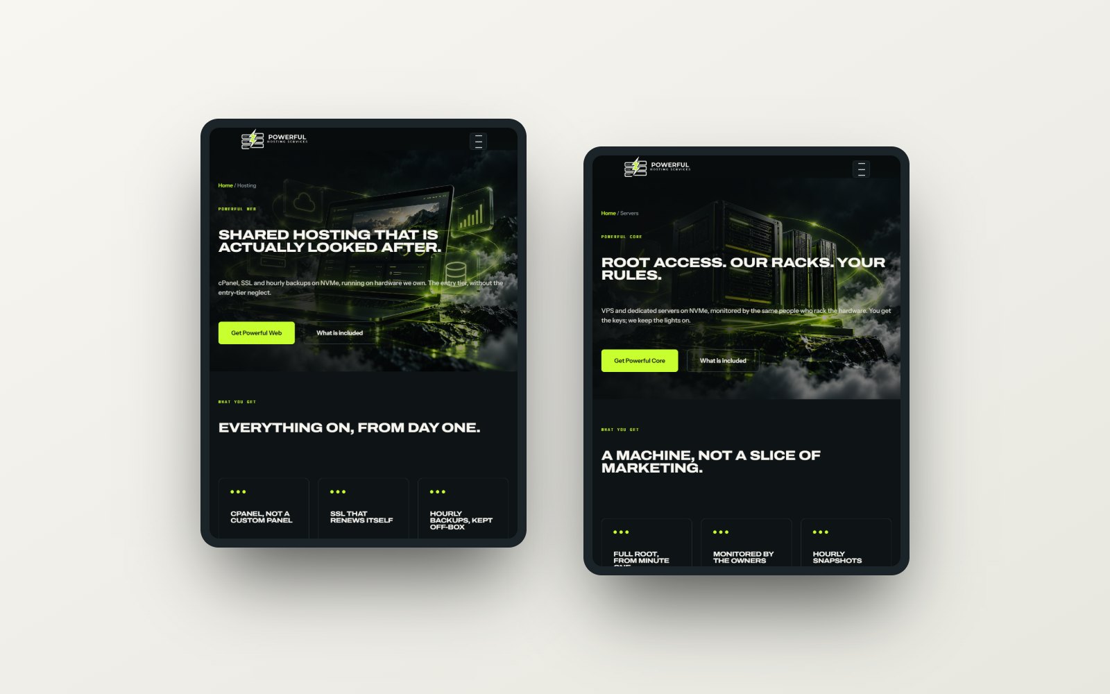
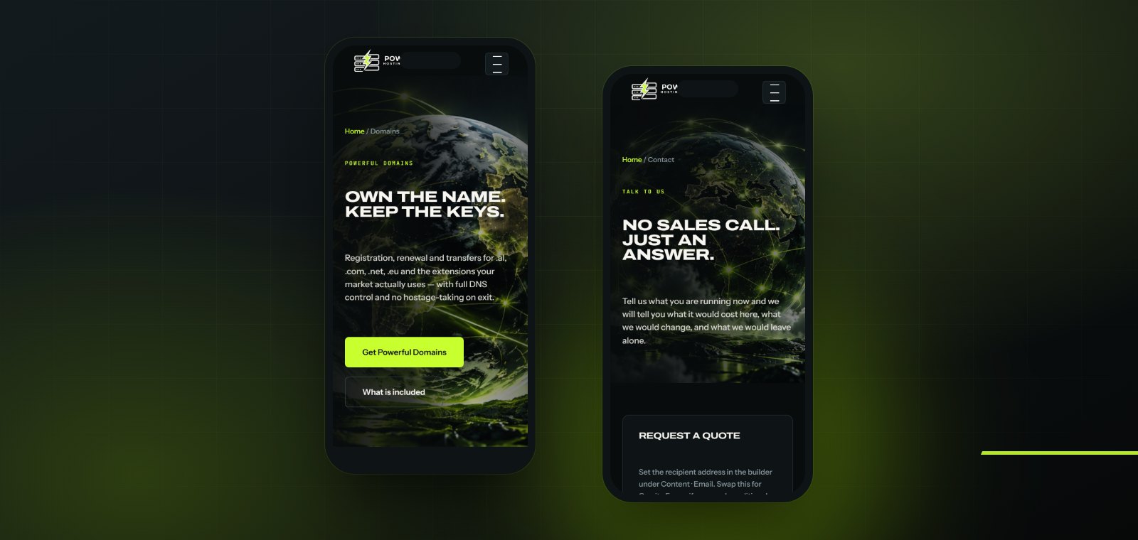
Brand identity and website for a hosting company that owns its own facility: one mark, one accent, and nine services that share a single invoice and login.
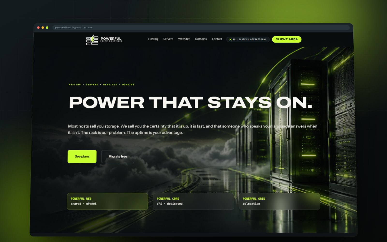
Powerful Hosting Services runs its own facility in Europe rather than reselling someone else’s. The site had to sell certainty instead of storage: that a machine is up, that it is fast, and that the person who answers the phone can walk to the rack.
Client
Powerful Hosting Services
Sector
Hosting and infrastructure
Scope
Brand identity, logo, web design and development
Site
powerfulhostingservices.com
THE IDENTITY
One accent, used once.
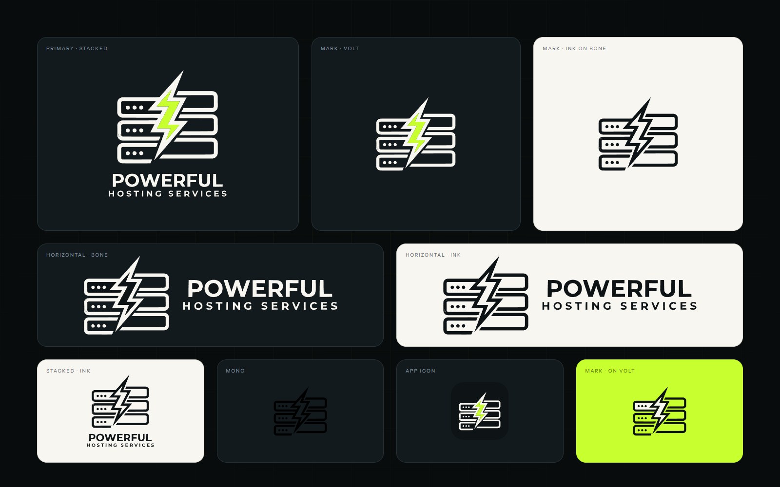
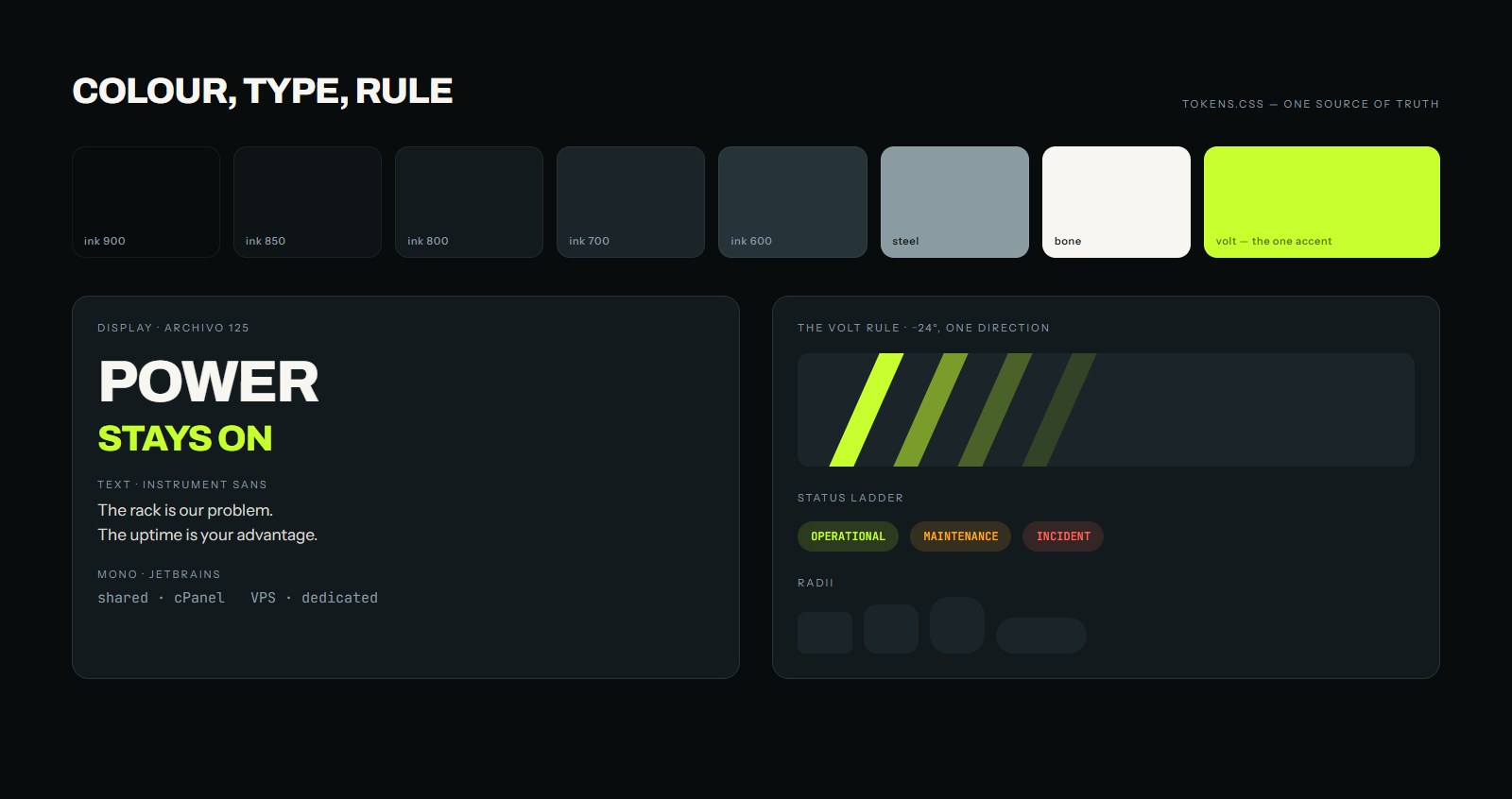
The mark is a rack with a bolt through it, drawn for a single colour and holding up at app-icon size. Volt green appears once per screen and never competes with itself, every rule runs at the same angle, and three type families carry display, text and specification. One token file is the source of truth for the whole build.
NINE SERVICES
Nine services, one supplier.
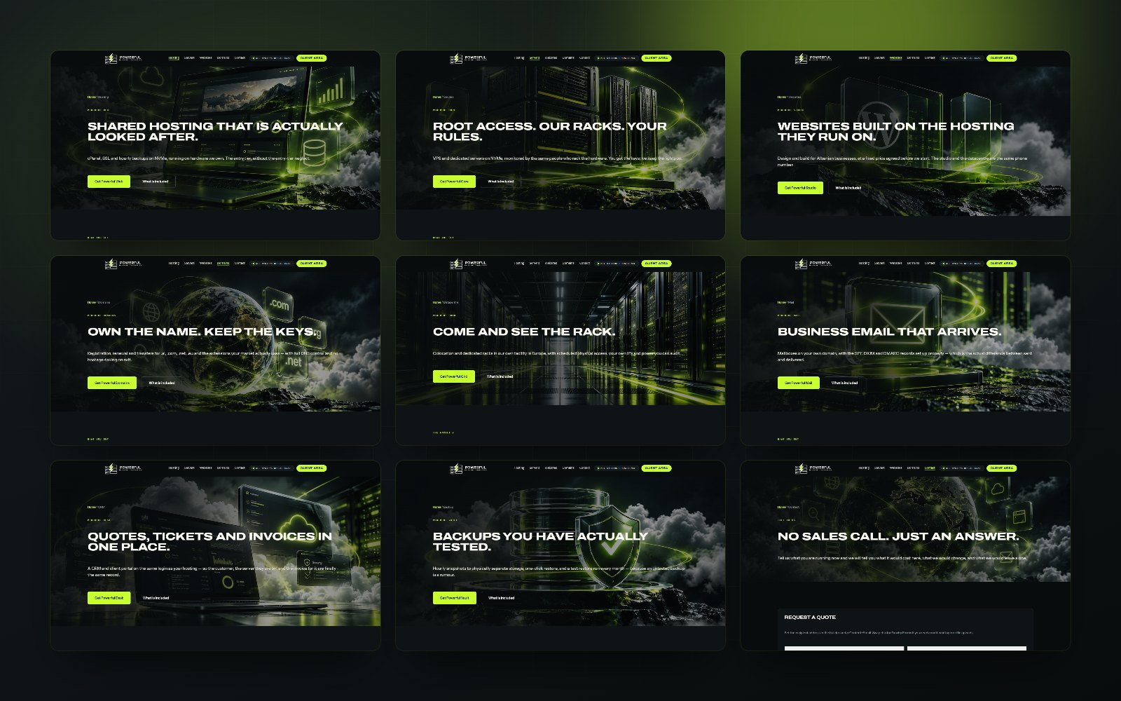
Web, Core, Domains, Press, Vault, Grid, Mail, Voice and Desk each get a full page with its own plans, but they share one invoice, one login and one phone number.
THE SPECIFICATIONS
Specifications on the page.
Every plan states its cores, memory, NVMe, traffic and IP allocation on the page itself. The colocation pages go further and describe the floor: scheduled physical access, redundant power, remote hands, and cooling planned above current draw.
EVERY SCREEN
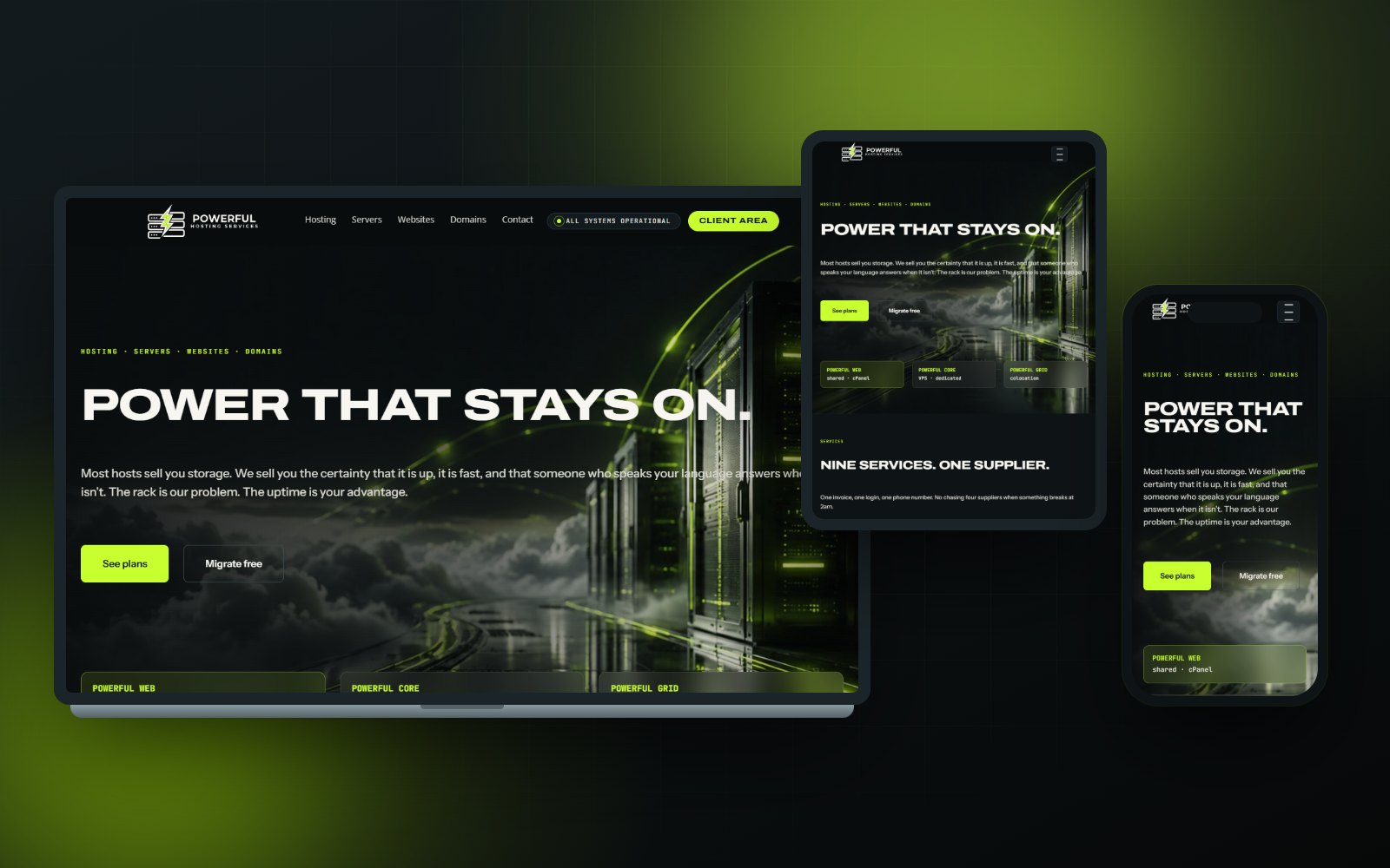
The same certainty at every width.
Plan tables reflow into stacked cards and the service grid becomes a single column, so a specification is as readable on a phone in a server room as it is on a monitor.
NEXT PROJECT
Nari Lundër
Branding, Photography, UI/UX Design, Web Design
We would like to count visits with Google Analytics, to see which pages are useful. It stays off unless you accept. Privacy policy