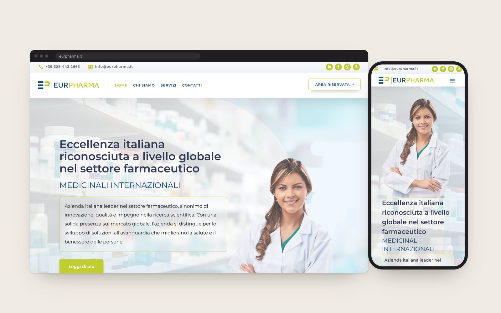
What it is. Eurpharma is a company in Rome that imports medicines and distributes them to pharmacies, hospitals and health professionals. Tech Fly designed its brand, its interface and its website.
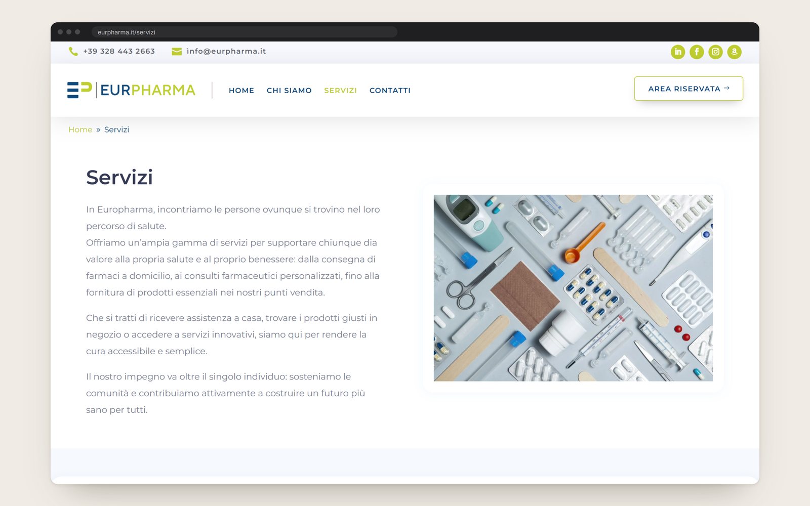
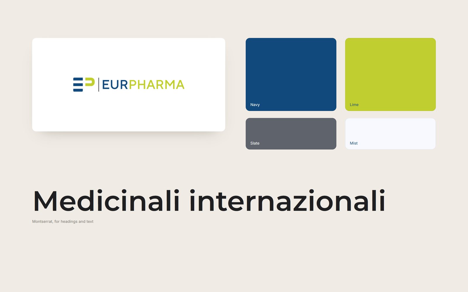
The mark. The logo sets the initials E and P as short bars beside the name. EUR is navy and PHARMA is lime, and the same two colours run through every page.
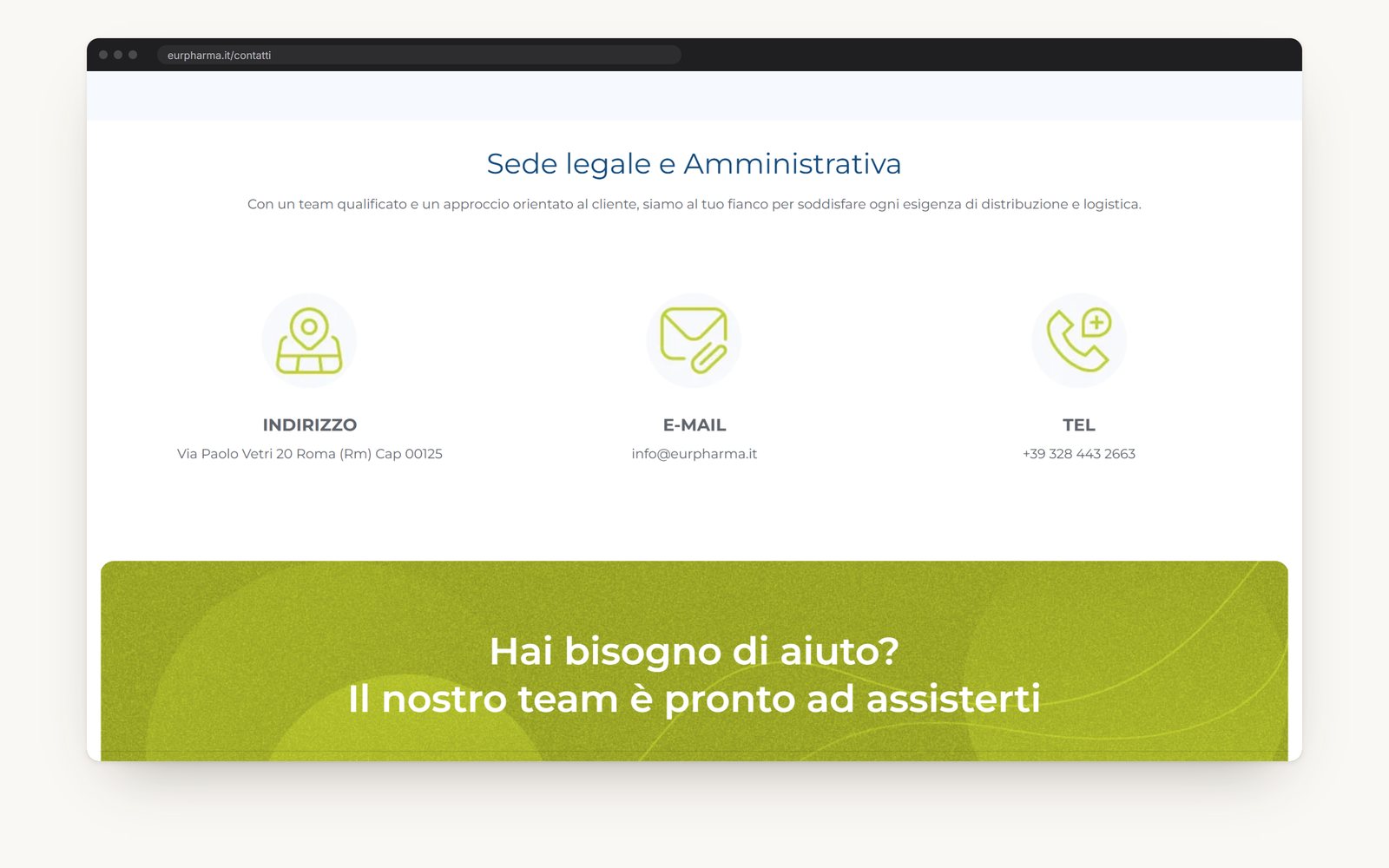
Two colours. Navy is for the name and the button that matters most. Lime is for icons, links and the band that asks a visitor to get in touch. The grounds are white and a pale blue.
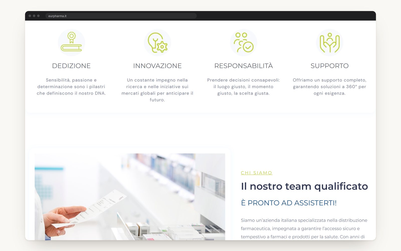
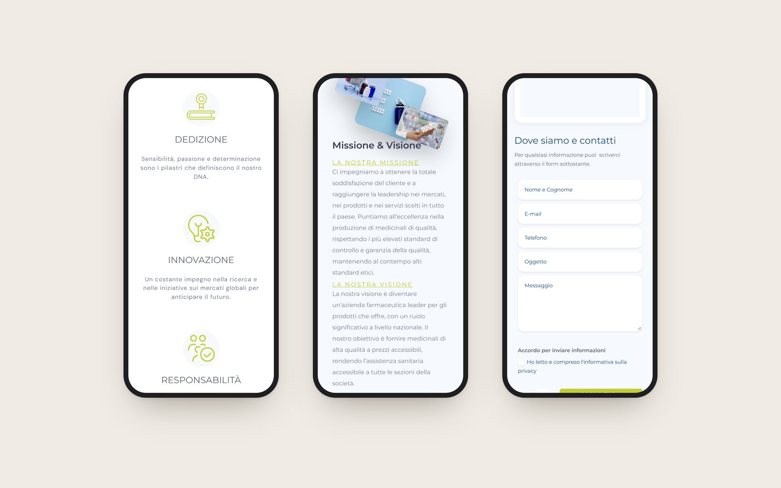
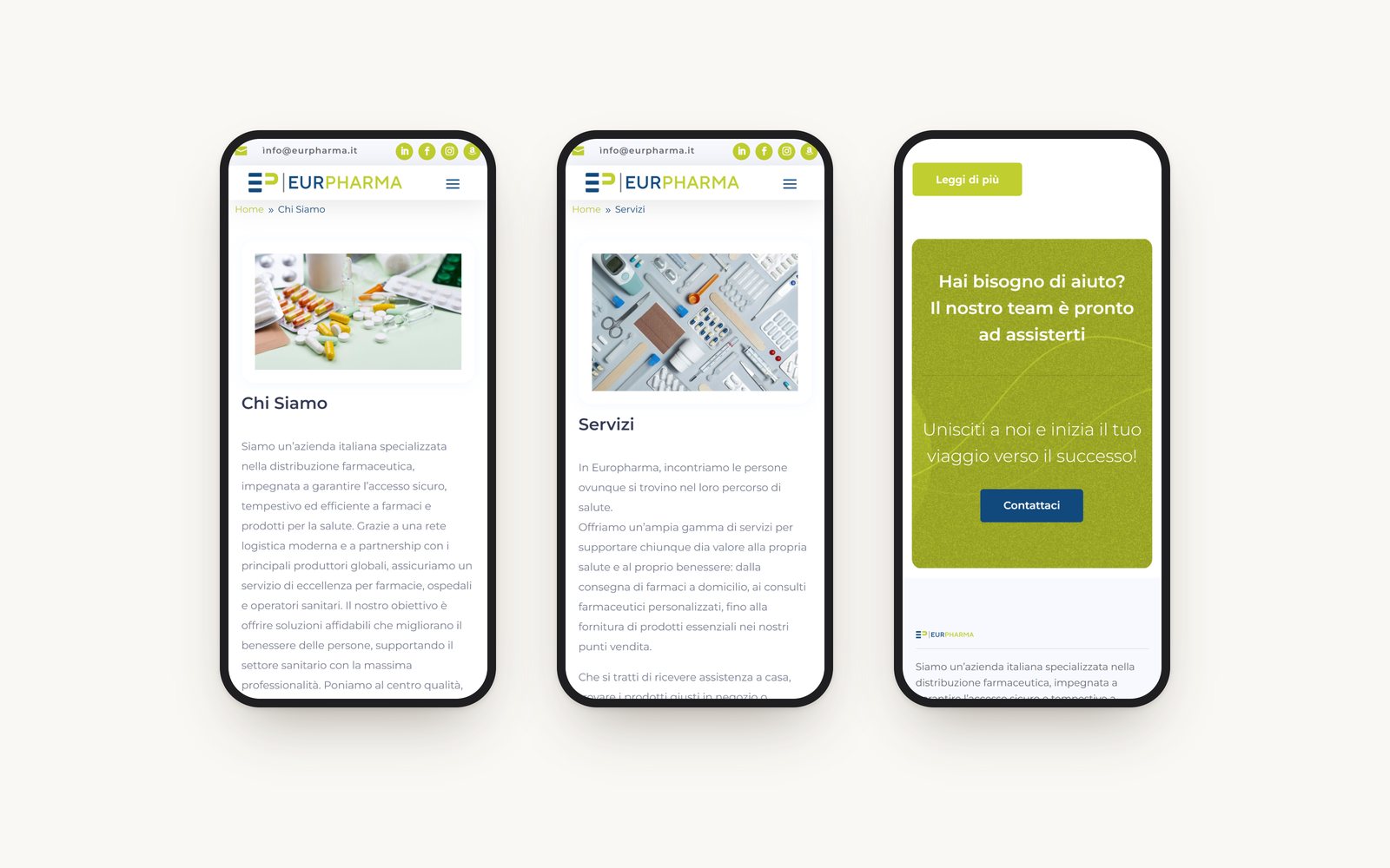
Four pages. Home, About, Services and Contact. The home page says what the company does in its first screen and then gives its four values, each with a line icon drawn for it.
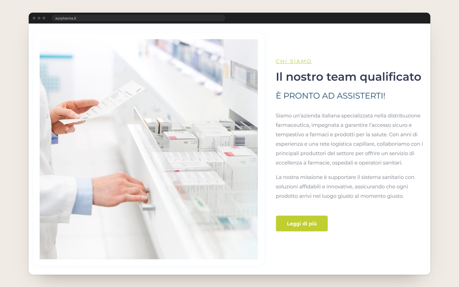
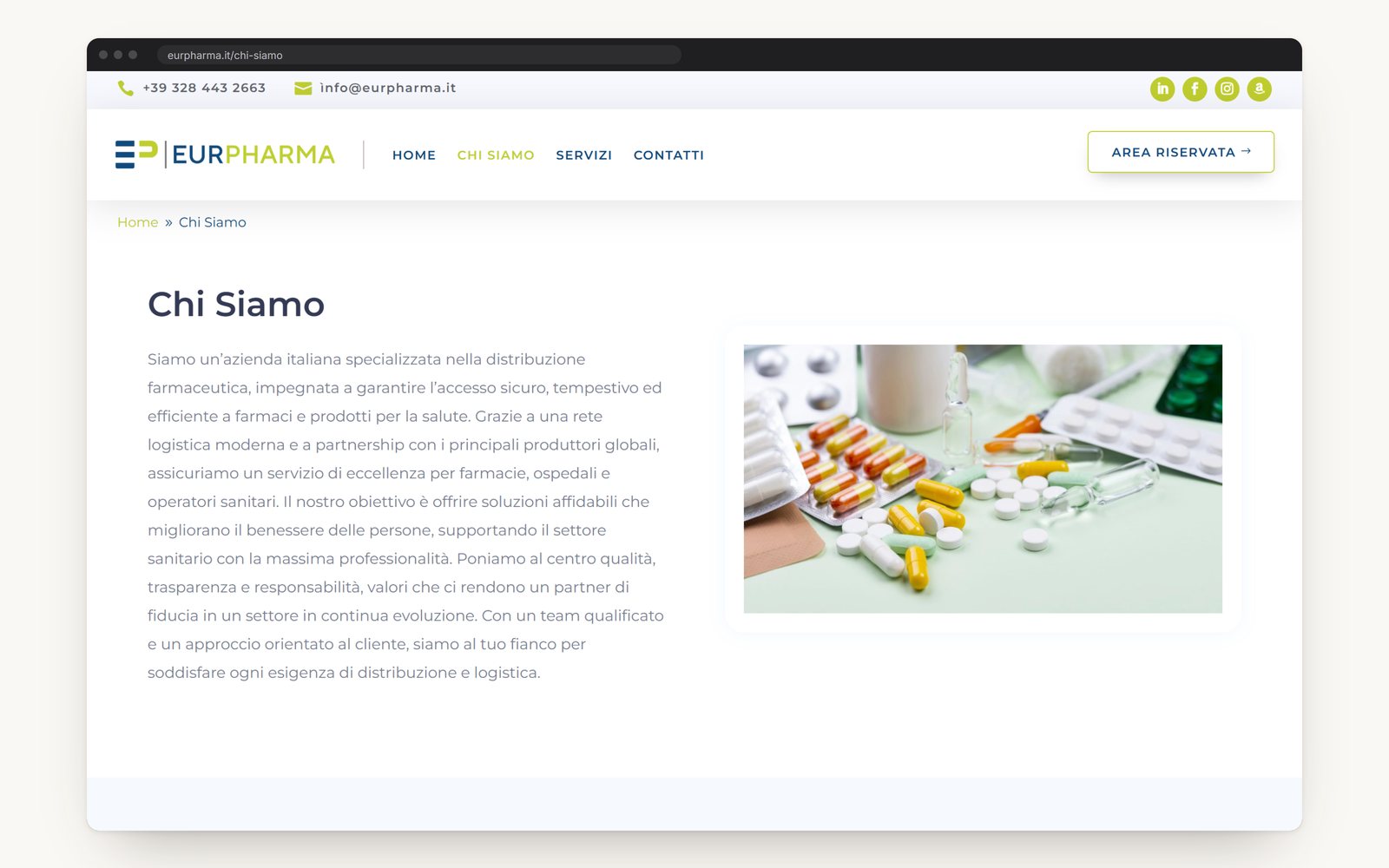
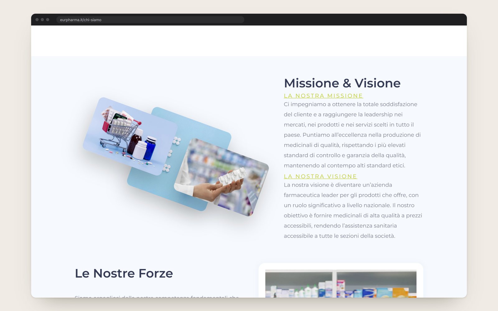
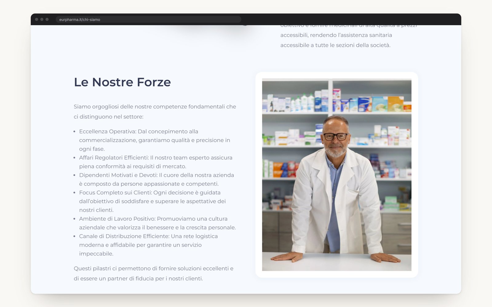
About. The About page sets out the mission, the vision and the company's strengths, each beside a photograph.
Contact. The Contact page has a form with a consent tick. Under it the office address, the email and the phone number stand as three cards.
On a phone. Every page folds into one column, with the menu behind one button.
One typeface. Montserrat, for headings and for text.