Gjergji Kompjuter

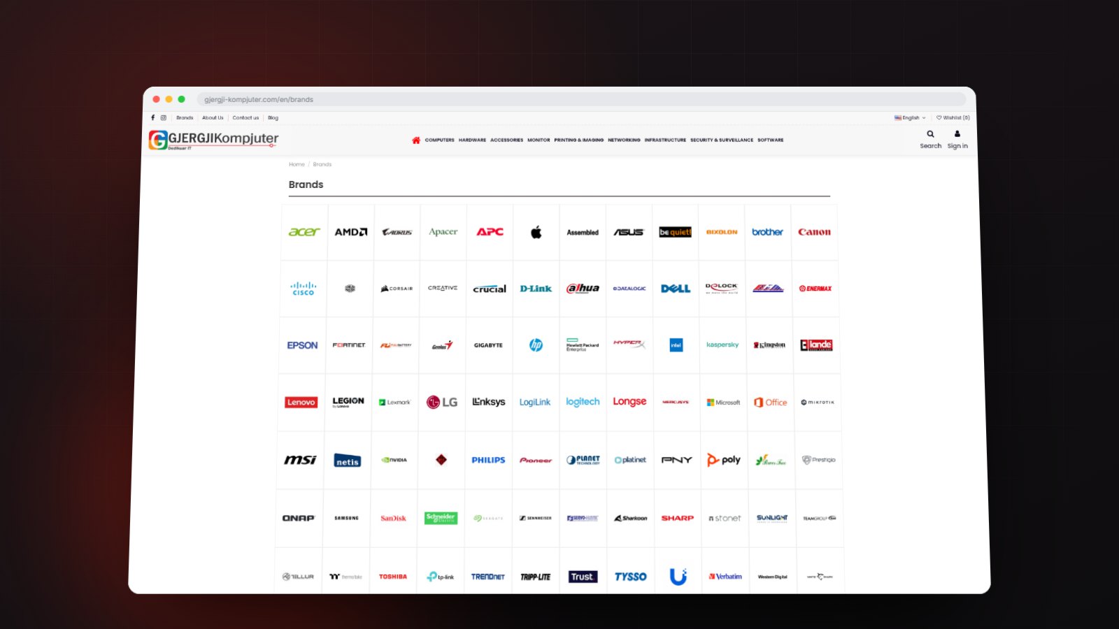
An IT store for an Albanian supplier: a deep hardware catalogue, eighty-five brands and twelve spec-level filters on a single shelf, with pricing and ordering behind a customer account.

Gjergji Kompjuter

UI/UX Design, Web Design

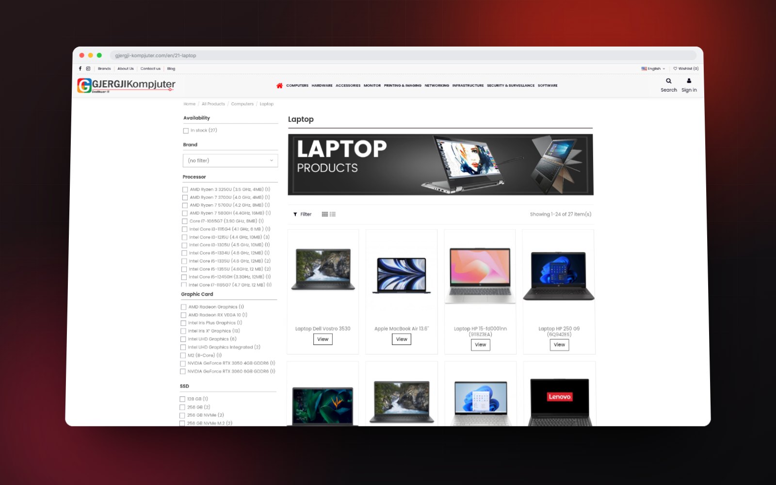
The Laptop category with its filter rail

THE BRIEF

An IT store that opens up when you sign in.

Gjergji Kompjuter supplies IT hardware across Albania. Anyone can browse the full range and read a complete specification. Pricing and ordering belong to account holders, so one store serves both a public reference and a trade counter.

Client

Gjergji Kompjuter

Sector

IT distribution

Scope

Catalogue architecture, UI design, development

Languages

English, Shqip

THE CATALOGUE

Every shelf, two clicks from the menu.

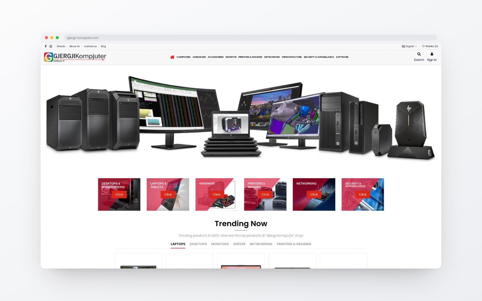
Computers, hardware, networking, printing, surveillance and software each open into their own shelves, with eighty-five brands indexed separately. The tree stays shallow enough to browse and precise enough that a buyer lands on the right shelf instead of a search box.

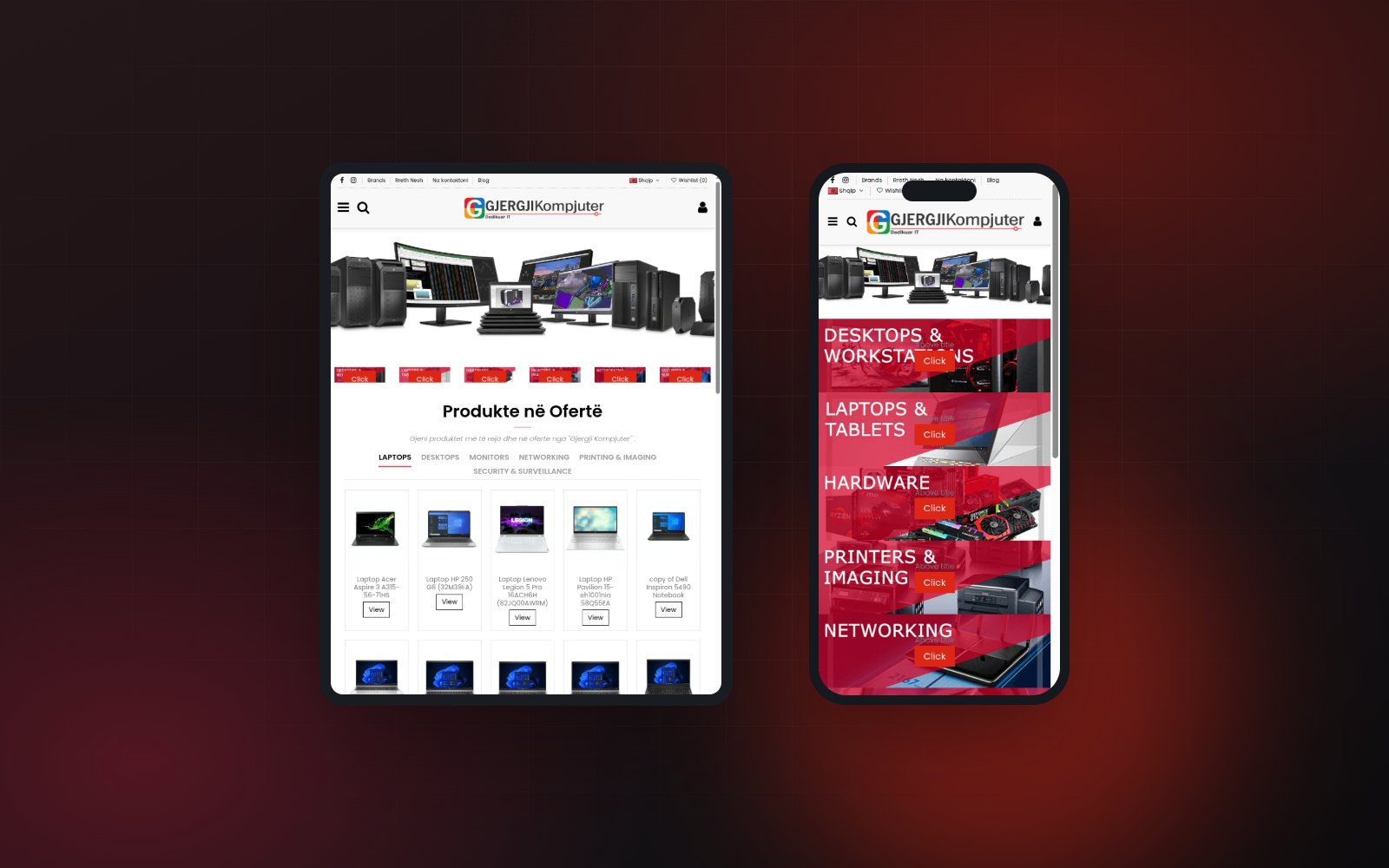
The Gjergji Kompjuter home page
The brand index

THE FILTERS

Twelve ways to narrow a single shelf.

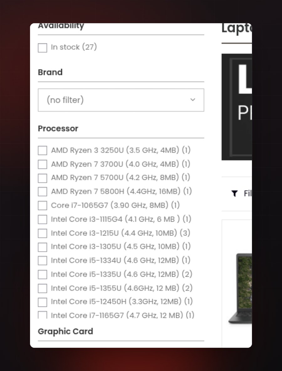
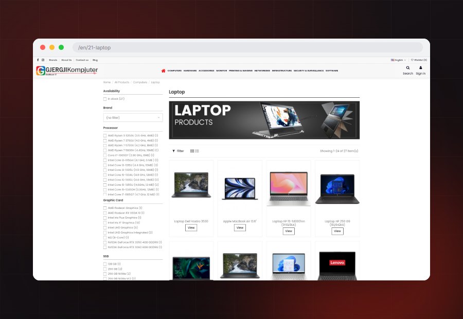
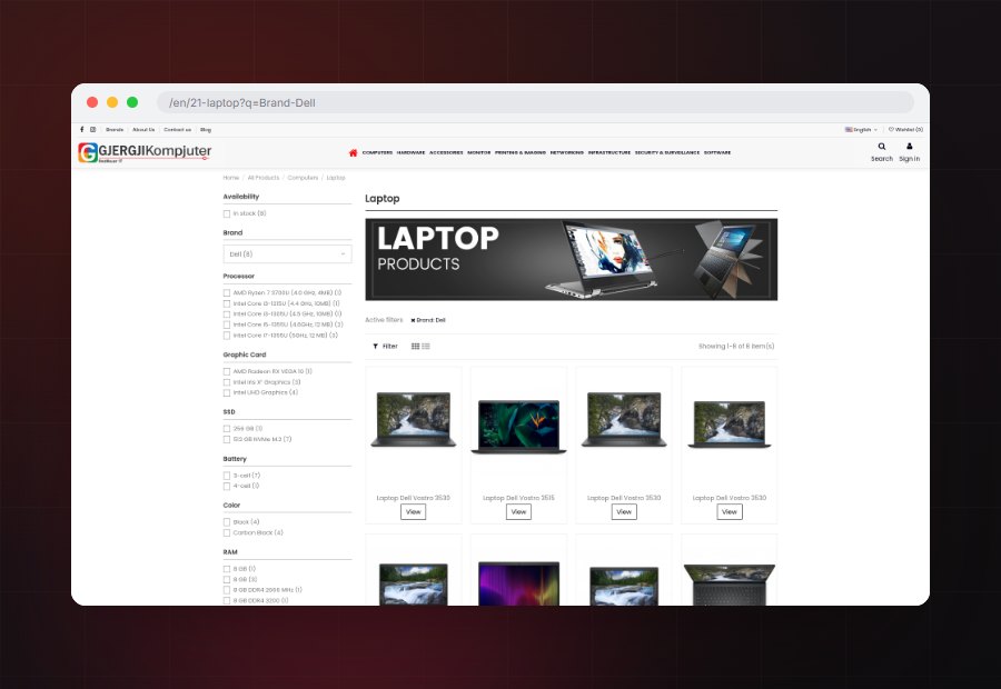
Laptop filters on availability, brand, processor, graphics, SSD, RAM, battery, colour, warranty, operating system, display type and screen size. Each option carries a live count, and applying one writes it into the address so a shortlist can be sent to a colleague.


The full filter rail with live result counts
The Laptop shelf showing every item
The same shelf narrowed to one brand

THE SPECIFICATION

Every product reads as a specification.

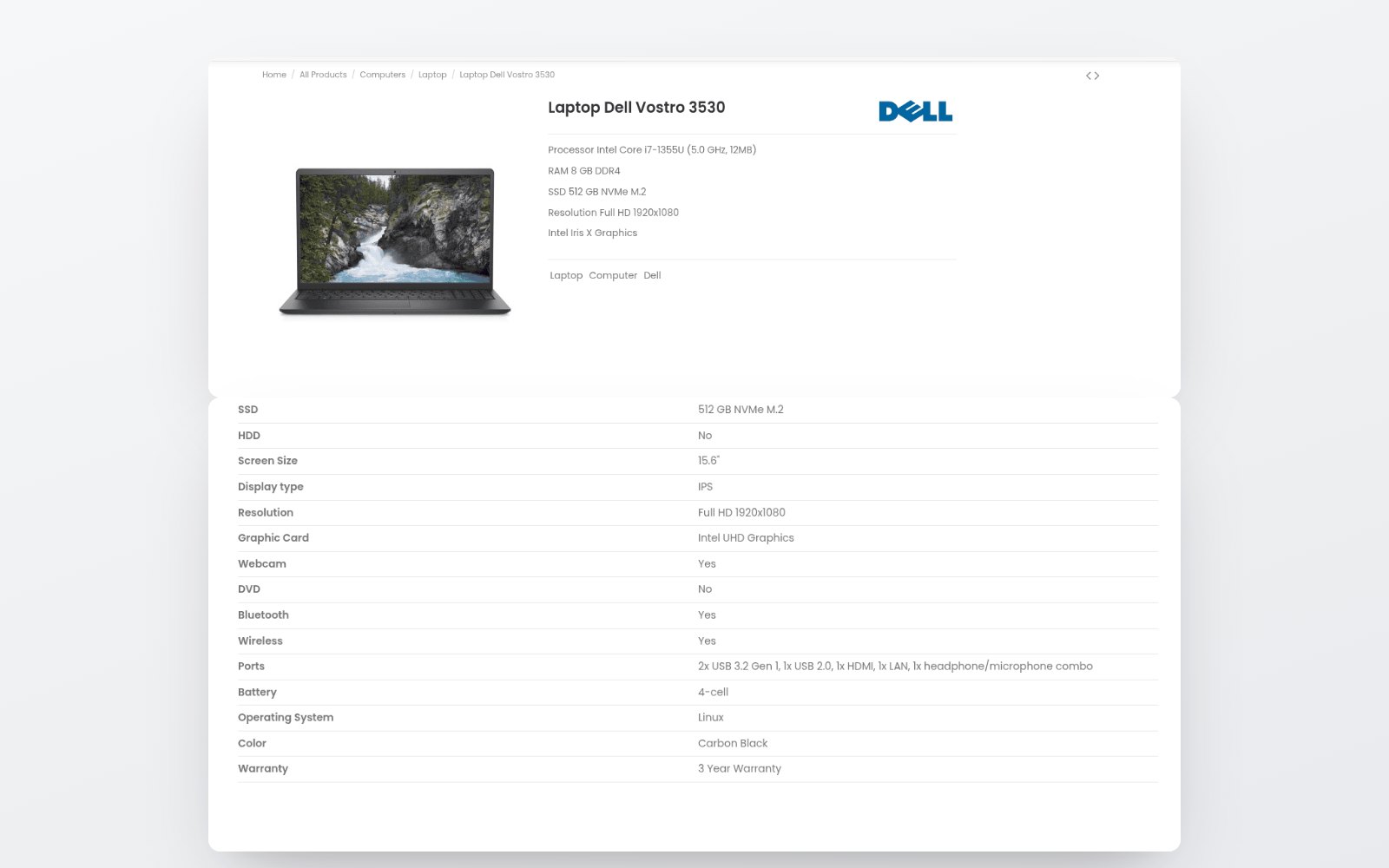
Processor, memory, storage, display, graphics and warranty sit on the page rather than inside a datasheet, so two machines can be compared line by line before either goes into an order.

A product block above its full attribute table

THE ACCOUNT

Pricing sits behind the account.

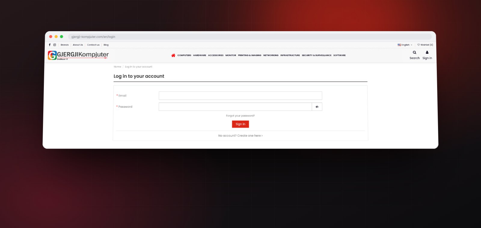
Registered customers sign in to see their own pricing and place orders. Everyone else still gets the whole catalogue, the same filters and the same specifications.

The sign in screen for account holders

EVERY SCREEN

One store, laid out three ways.

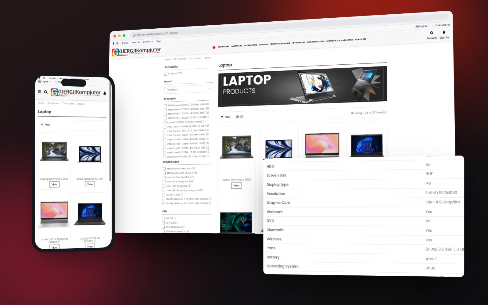
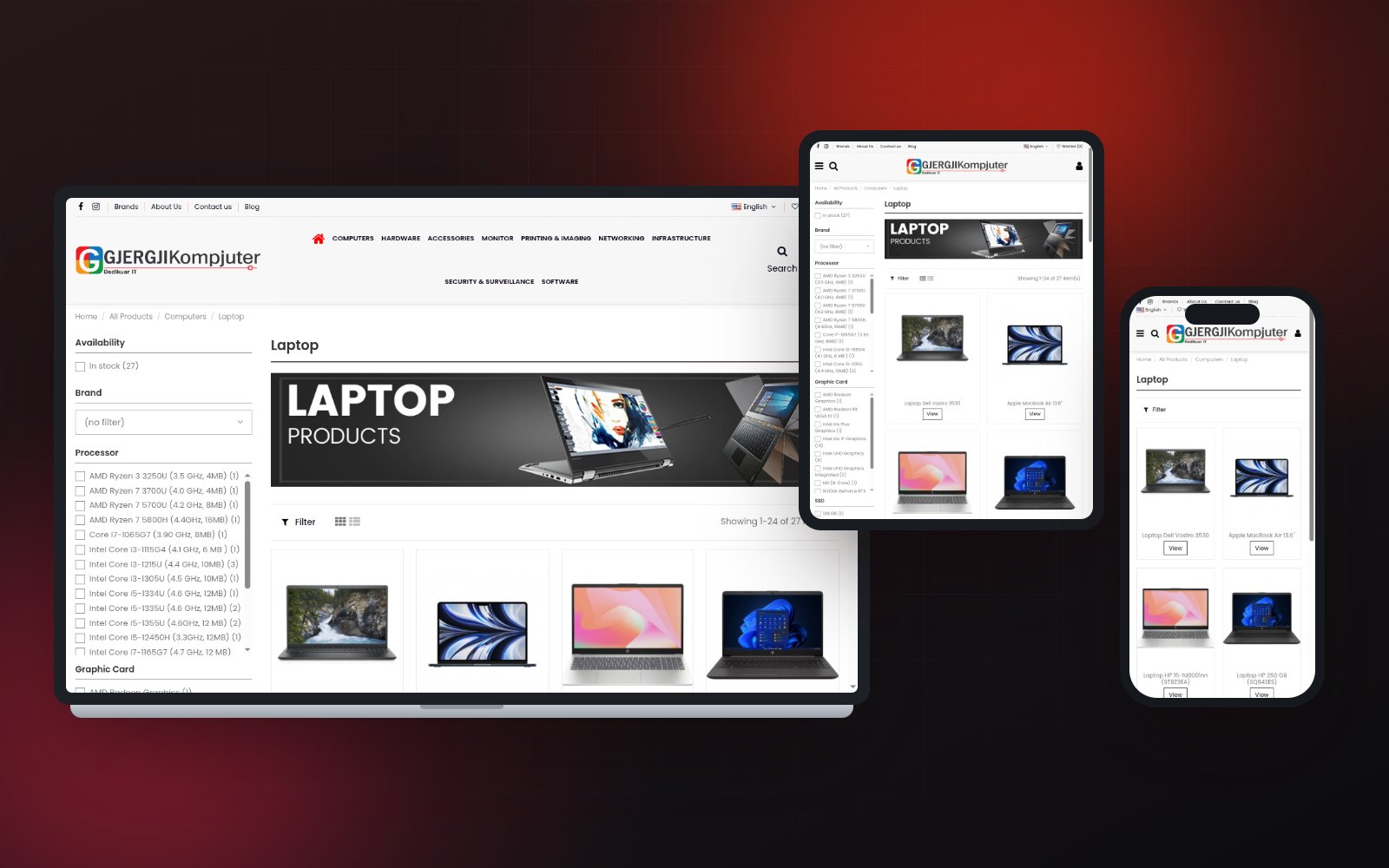
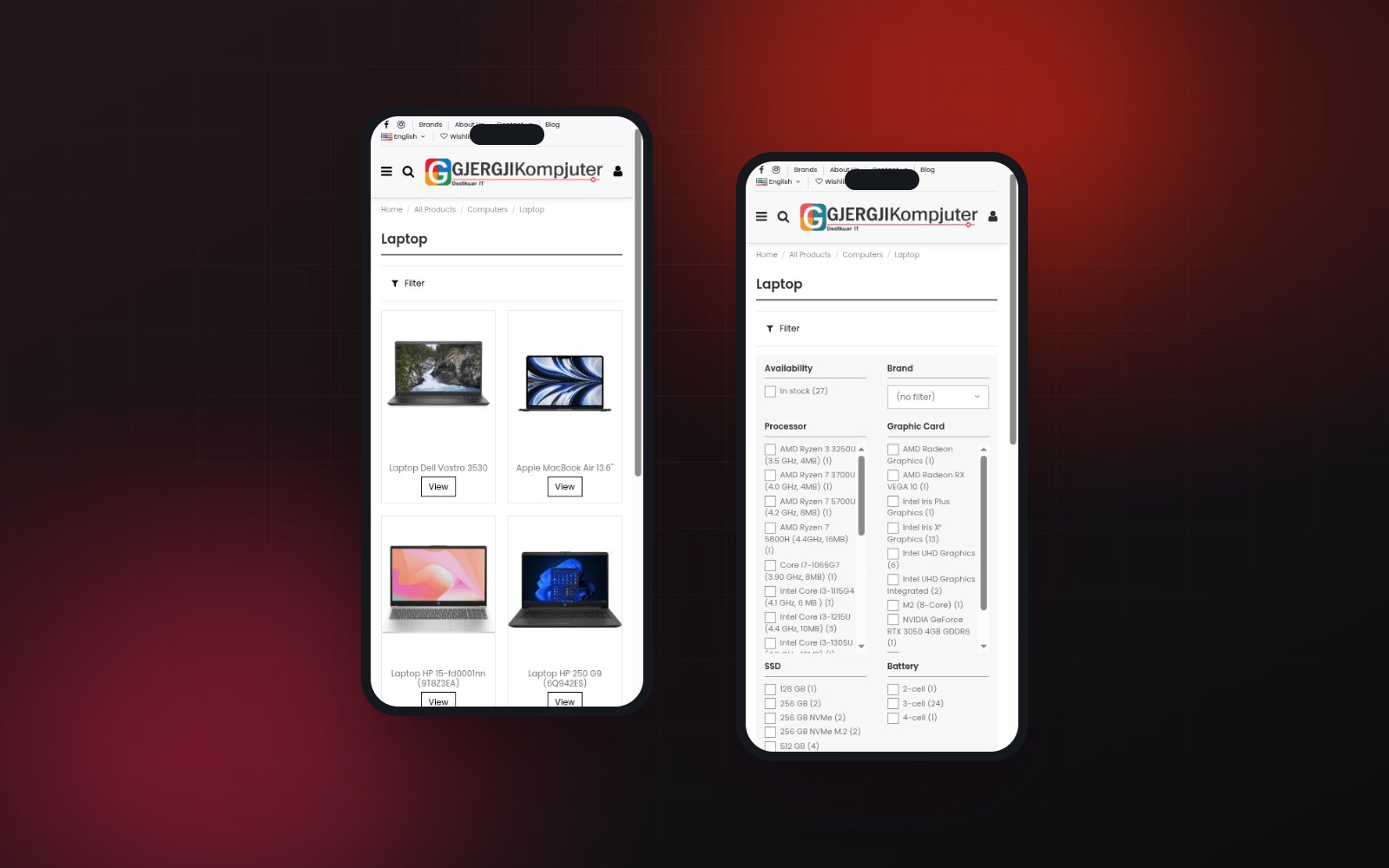
On a laptop the filter rail sits beside the results. On a tablet it narrows and the grid reflows. On a phone the whole rail folds behind a single Filter control and opens as a two column sheet, so a buyer standing in front of a rack can still reach an exact model.

The same category on laptop, tablet and phone
The mobile filter closed, then opened as a two column sheet
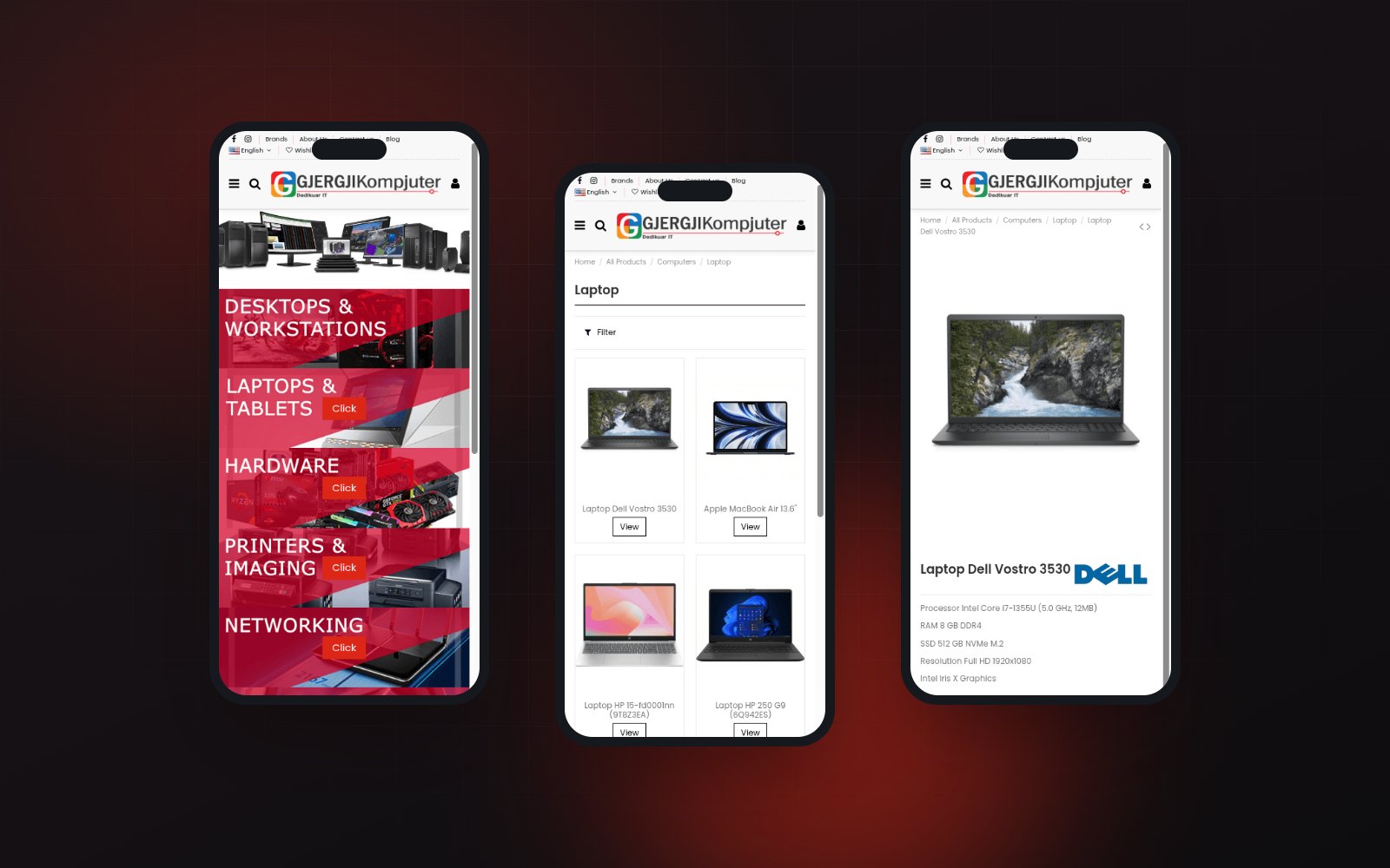
Home, category and product on a phone
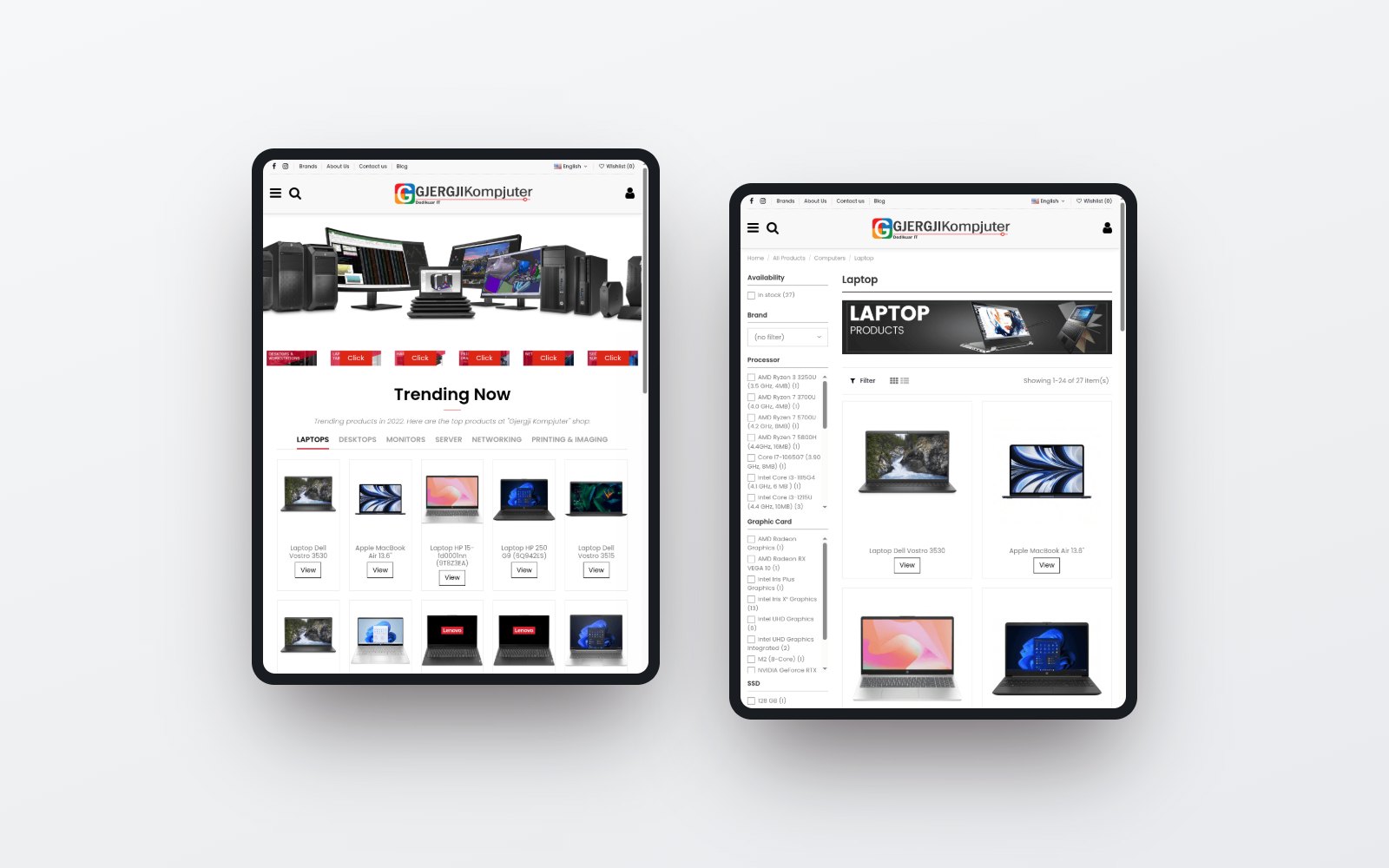
Home and category on a tablet
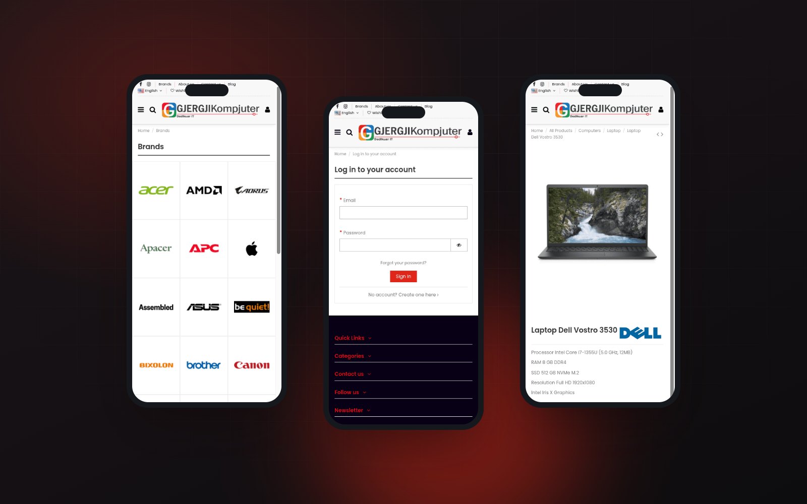
Brands, sign in and a product page on a phone
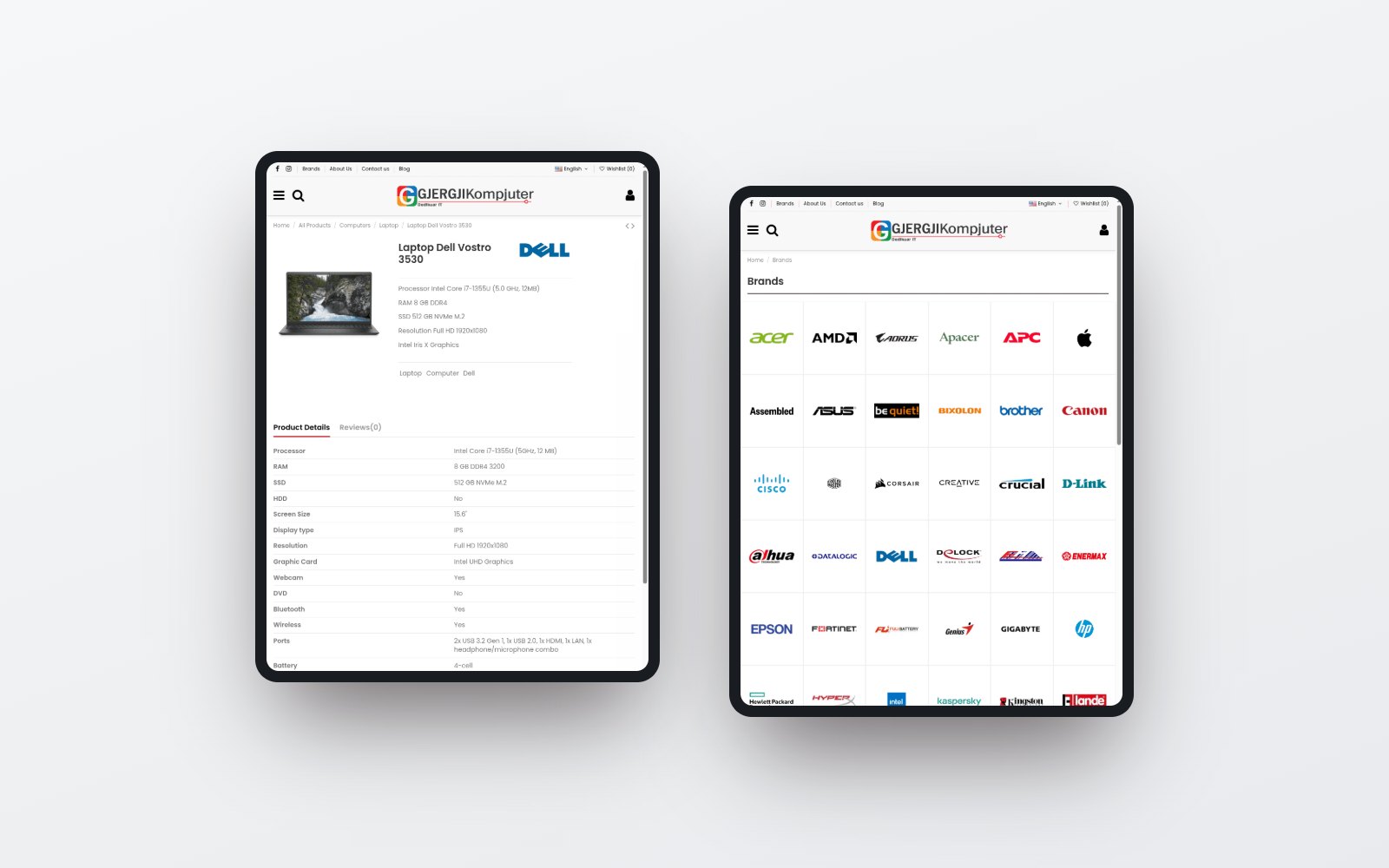
A product page and the brand index on a tablet

TWO LANGUAGES

One catalogue, in English and Shqip.

Every category, filter and specification runs in both languages, and so do the addresses.

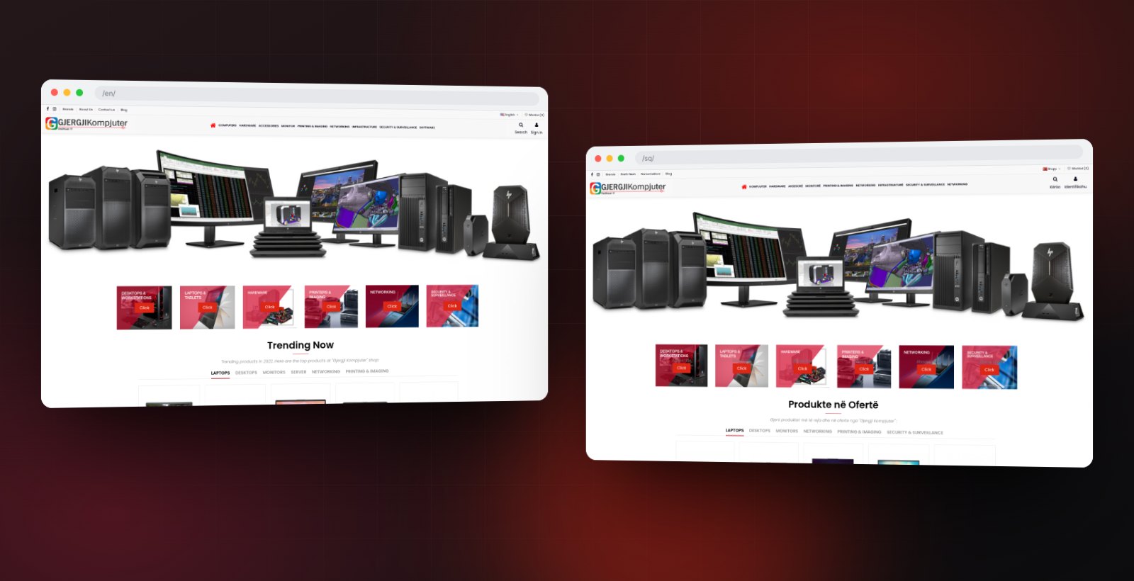
The English and Albanian storefronts
The Albanian storefront on tablet and phone

NEXT PROJECT

Juliette Armand

UI/UX Design, Web Design